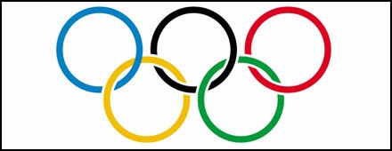
 The Olympic rings. Five interlocking, multi-colored circles. Since a child, I have been enamored by this powerful, timeless icon of competition through sportsmanship, a symbol conveying both diversity and unity, rivalry and harmony. Even in the midst of wars and international conflicts, the Olympic logo has reminded us around the world that we are one. Every nation, every tongue, we all bear the same blood. We are truly different, yet truly interconnected.
These rings, comprised of five bold colors: blue, yellow, black, green, and red, respectively, are each representative of nations, bearing the national colors of every national flag around the globe. Interestingly, some believe that the colors represent the five original, inhabited continents: Africa, America, Asia, Australia, and Europe. The symbol was designed in 1912 by a French man, Baron Pierre de Coubertin, founder of the International Olympic Committee and the Olympic Games. Often contrasted on a background of white, the rings are traditionally displayed on flags in cities where the Olympic Games will be appearing next.
During the London 2012 Summer Olympics, I couldn’t help but notice the numerous athletes, from various countries all over world, bearing the colorful rings as a tattoo on their body. The indelible ink proudly displayed as a mark of honor, prestige, and camaraderie among fellow athletes, revealing to others the unparalleled commitment to their sport and their life-long allegiance to the Games. Of course, the rings symbolize different things to different people, but I would submit that no matter what country you are from, one thing is for certain – we all can identify with the iconic symbol. What other logo do you know of that can do that? From a design perspective, its universality is nothing short of remarkable.
On the website Graphic Design History, there is a section entitled, “Paul Rand on Timelessness in Symbol Design.” Within this section, there is an excerpt from one of Rand’s essays, called, “Thoughts on Design.” There Rand, who is creator of the IBM and UPS logos, states:
The role of the logo is to point, to designate—in as simple a manner as possible. A design that is complex, like a fussy illustration or an arcane abstraction, harbors a self-destruct mechanism. Simple ideas, as well as simple designs are, ironically, the products of circuitous mental purposes. Simplicity is difficult to achieve, yet worth the effort.
The effectiveness of a good logo depends on:
- Distinctiveness
- Visibility
- Usability
- Memorability
- Universality
- Durability
- Timelessness
Rand’s definition of an effective logo is fantastic. His advice, even 40 years later, remains credible wisdom to heed for anyone who really desires a winning logo. Simplicity, clarity, and neutrality – all targets worth shooting for.
So what does your logo say? What does it say about you? Good, bad, or indifferent, all logos say something. Is it conveying the brand identity you desire? If it’s not, it may be time for a change. The Olympic rings give us a good guide to follow by proving that a great logo requires nothing extravagant, nothing complicated – just bold, clean, and sophisticated.
*Article originally posted on AMPED creativ: http://ampedcreativ.com/index.php/ampedblog/item/your-logo-speaks-what-is-it-saying
